Designing for retail conversations
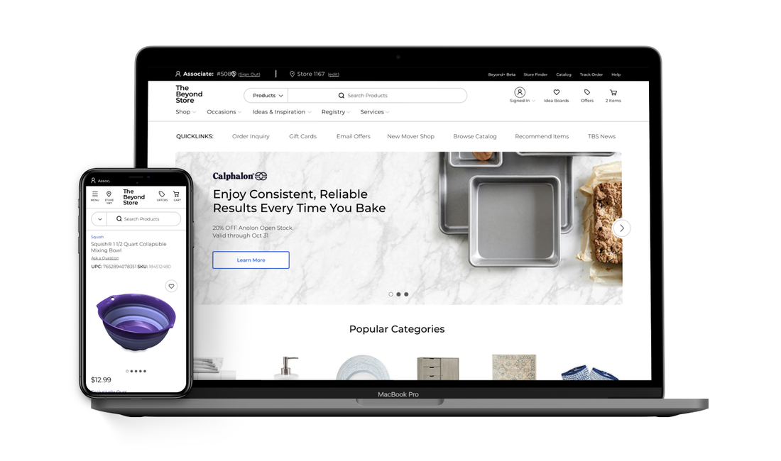
TheBeyondStore (TBS) was Bed Bath & Beyond's internal platform for product lookup, inventory, and transactions. About 65,000 store associates used it daily.
But associates never use TBS alone. They use it mid-conversation with a customer standing right there, often looking at the same screen. The associate is half of a pair trying to make a decision together, which means TBS is really a customer-facing interface operated by an associate.
Contribution
Interaction design for product discovery, pricing, and purchase flows. Main focus: reframing the user from "the associate" to "the associate-customer pair."
The system
Assisted selling is a conversation. A customer asks about a product, the associate searches. The customer hesitates on price, the associate checks for coupons. Out of stock? Alternatives, nearby stores. Now the associate is juggling three products while maintaining eye contact.
The old TBS was built for task completion. Every lookup, every price check meant navigating away. That pulls the associate out of the conversation and creates pauses: "Let me just... check on that... one second..."
Two principles
These came from watching how associates actually work during customer interactions.
Keep the conversation on one screen
If the associate has to navigate away to answer a question, that's a failure. Availability, alternatives, product details should be visible where decisions happen.
Settle pricing before checkout
Pricing surprises at checkout kill deals. If the associate can show the final price earlier, customers can commit before they reach the register.
How this played out
Finding products
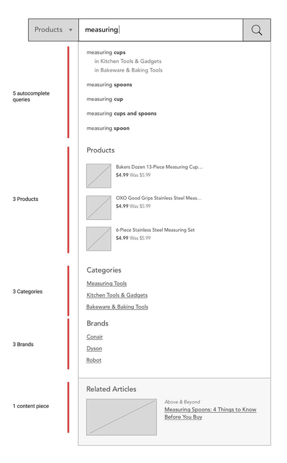
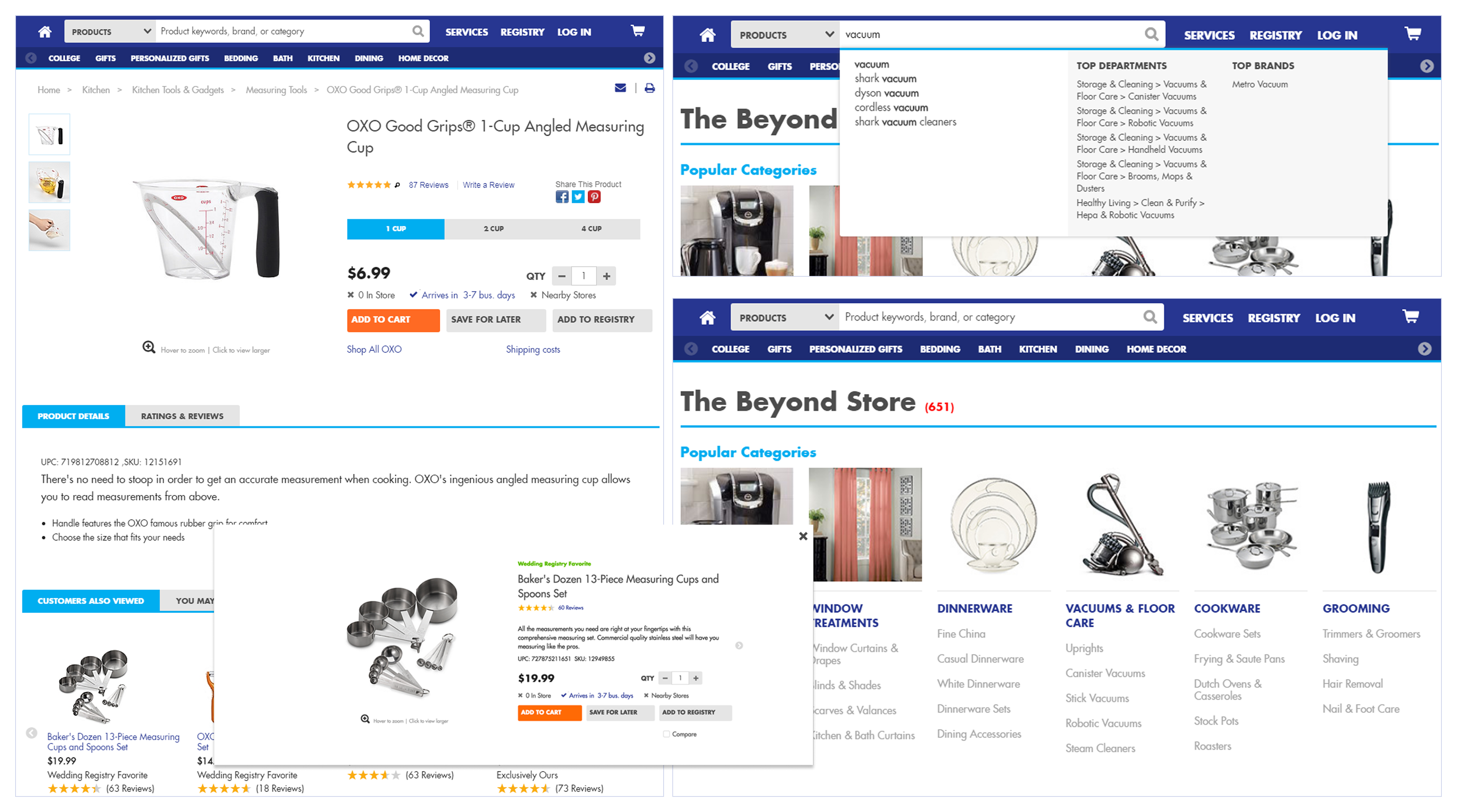
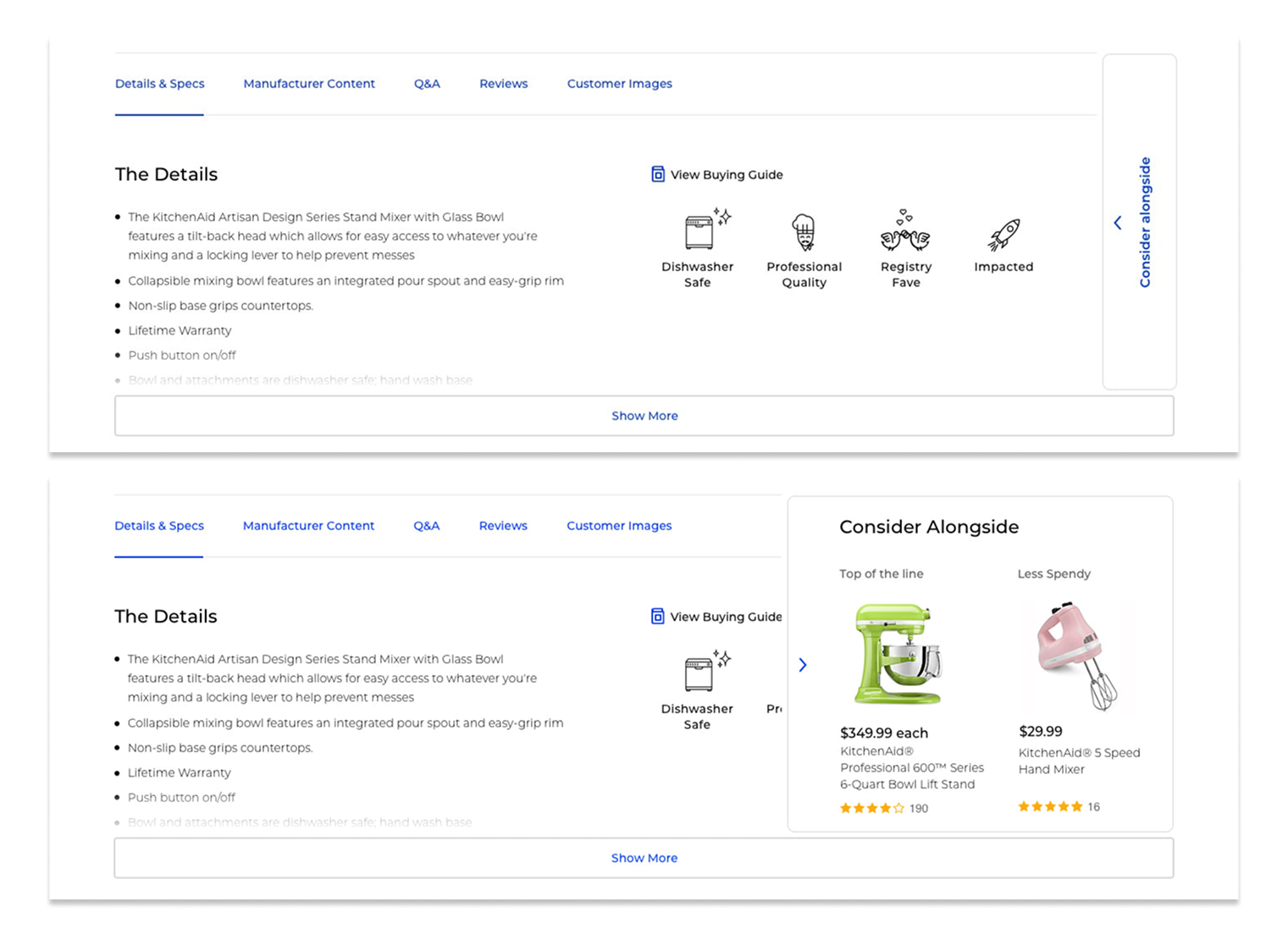
In-store searches start vague ("something for my kitchen," "a gift for my mom"). The old search only returned products.
We added categories, brands, and content to results so associates could ask: "are you thinking small appliances, or more like decor?"
Stock and alternatives
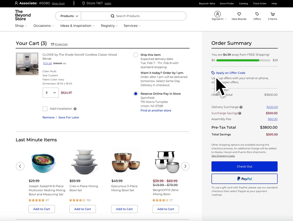
"Do you have this in stock?" is the most common question in retail. The old design showed inventory as binary and required navigating to see it.
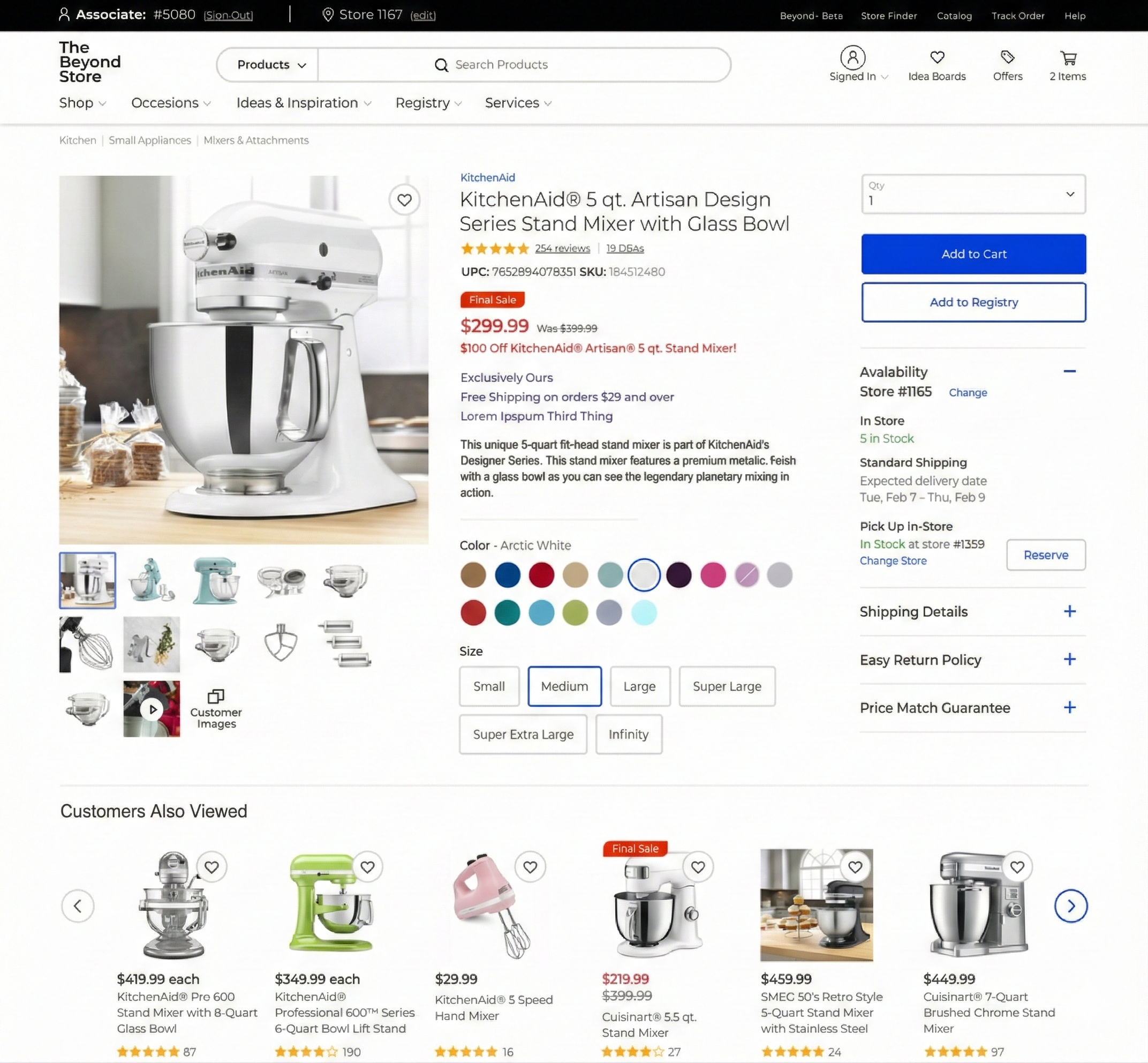
When customers change direction, the "Consider Alongside" panel surfaces options without leaving the page.
The customer says "that's more than I wanted to spend" and the associate already has a cheaper option visible. No navigation, no losing context.
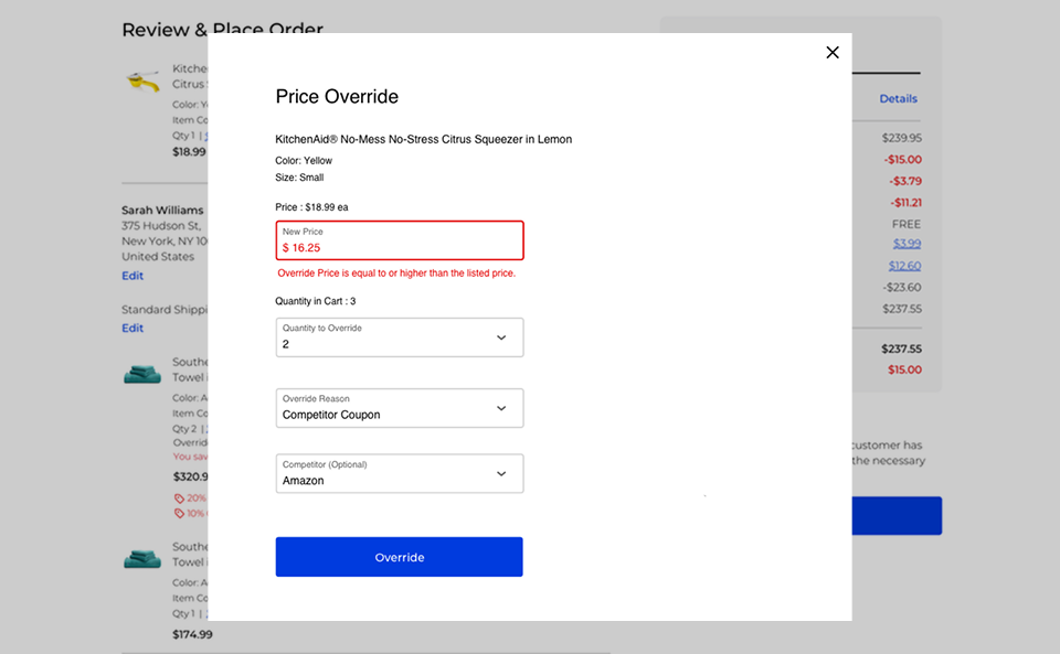
Settling on price
Price overrides and coupons existed but were buried in checkout. By then the customer has already decided. If they were on the fence about price, they walked ten minutes ago.
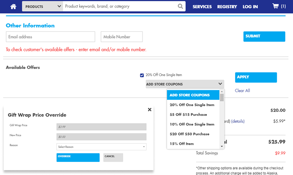
The old coupon interface required manually searching through offers. Price overrides were hidden in a separate flow.
We moved coupon tools to a new order review screen. The panel pulls in offers tied to the customer's account, making "let me check what discounts you have" a one-click action.
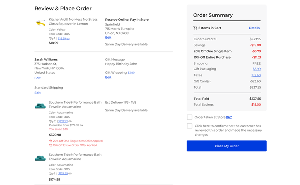
The override modal captures competitor information (useful for merchandising) and is accessible earlier in the flow.
What changed
Fewer navigation detours during conversations. Less "let me check on that" and more addressing objections in the moment. Prices settled earlier, fewer surprises at checkout.
Post-launch metrics weren't shared with the design team. The work shipped as part of a larger transformation, and Bed Bath & Beyond's subsequent trajectory makes it hard to isolate any single initiative's impact.
Reflection
The useful frame: this isn't a tool for the associate, it's an interface that sits between two humans and shapes their interaction. That changes what you ask:
- What does the customer see while the associate uses this?
- Does the tool's pace match the conversation's pace?
- When does the interface make the associate look competent vs. struggling?
Measuring this is hard. Task completion time doesn't capture conversational flow. NPS is too blunt. Something about reducing the moments where the tool interrupts the human relationship would be worth measuring, but I don't know how.