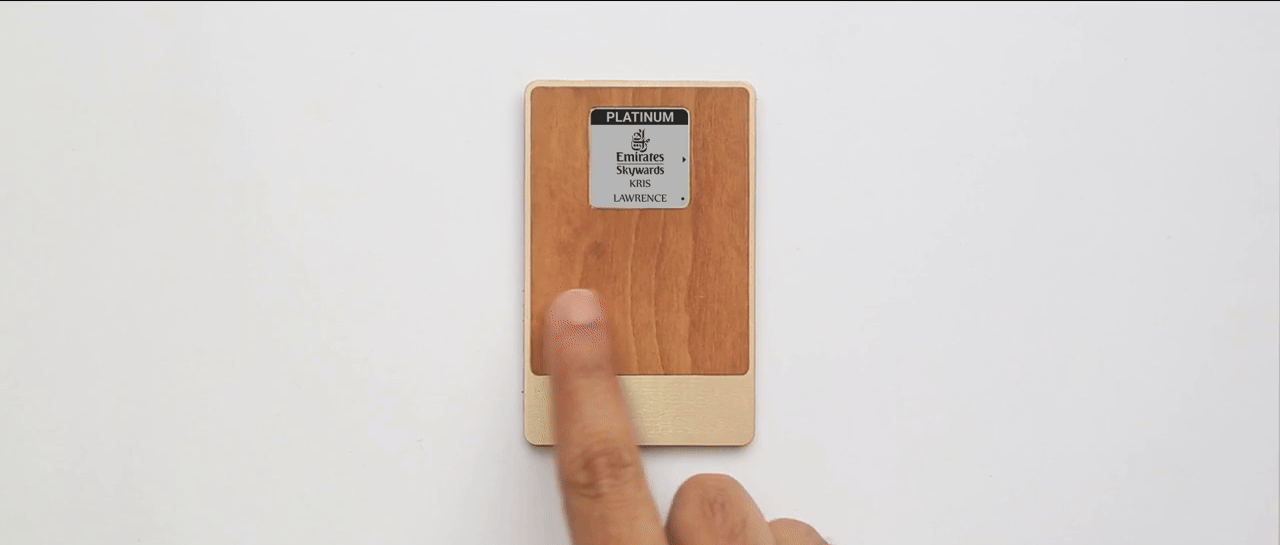
Emirates wanted more than a digital boarding pass. The card needed to handle three tasks: flight information, Skywards Miles payments, and airport wayfinding. A 1.26 inch monochrome e-ink screen and five gestures to work with.
Contribution
Designed the interface for a wallet-sized air travel companion. Main focus: deciding what deserved active attention, what needed to interrupt, and what could stay in the background.
Information on demand
The screen handled active lookup. Flight details, gate, seat. A QR code for boarding. Miles balance and tap-to-pay. Navigation menus for finding the lounge or nearest restaurant.
Flight time and gate got the default view. That's what gets checked constantly. Everything else was one gesture away.
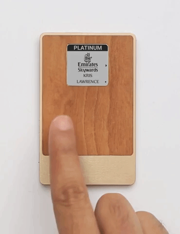
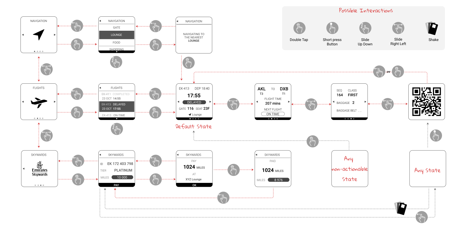
Gestures were limited to five: double-tap, slide in four directions, and a button press. Horizontal slides switch between the three modes (flights, navigation, miles). Vertical slides go deeper within each. Double-tap cycles through a list.
Information that demands
A monochrome e-ink display can show information, but it can't reach the user. It can't flash, badge, or draw attention to itself. If a gate changes, the user has to already be looking at it to notice.
Gate changes, delays, wayfinding directions. These need to arrive in the moment. The screen couldn't handle any of it.
So interruptions got their own channel: an 8x8 pixel grid. When something changes, an icon lights up, a beep sounds, and the screen updates with details.
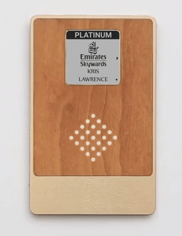
Each icon had to be recognizable in 64 pixels, obvious enough to understand while walking to a gate.
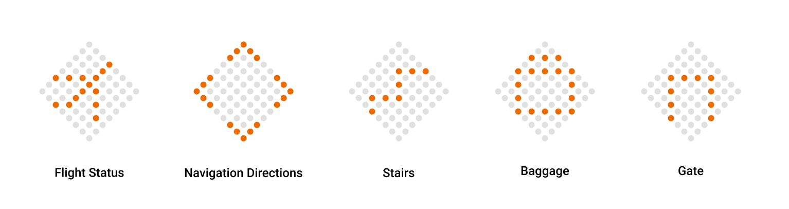
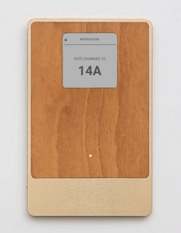
A gate change in action: the grid lights up, then the screen shows the new gate number.
The tradeoff: a new visual language to learn. But missing a gate change is worse.
Information in the periphery
In early testing, people kept asking "how much time do I have?" But they didn't need a precise answer. They needed to know if they could grab coffee or should head to the gate.
This wasn't a lookup or an alert. It was ambient awareness, something sensed peripherally, not actively checked.
A countdown on the main screen would take space from flight details. The solution was a ring of lights that fills as boarding approaches. Not a timer, just a growing sense of urgency.
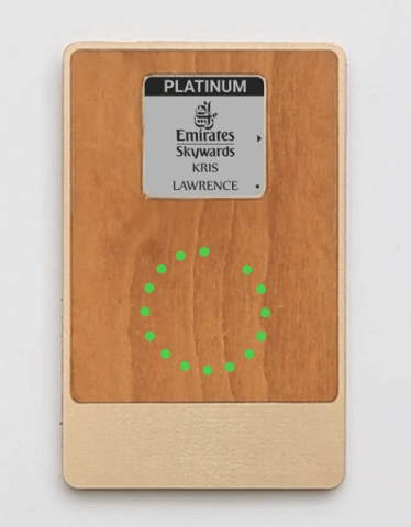
The difference that matters is "plenty of time" versus "go now." A glance tells enough.
Reflection
The hardware constraint forced a question: what kind of attention does this information deserve?
On a phone, everything competes on the same screen. Here, I had to classify information first: what's pulled on demand, what needs to push, what lingers in the background. The interface followed from that. Three types of information, three output channels, each with its own interaction model.
Most interface work starts with screens and flows. This one started with information behavior.